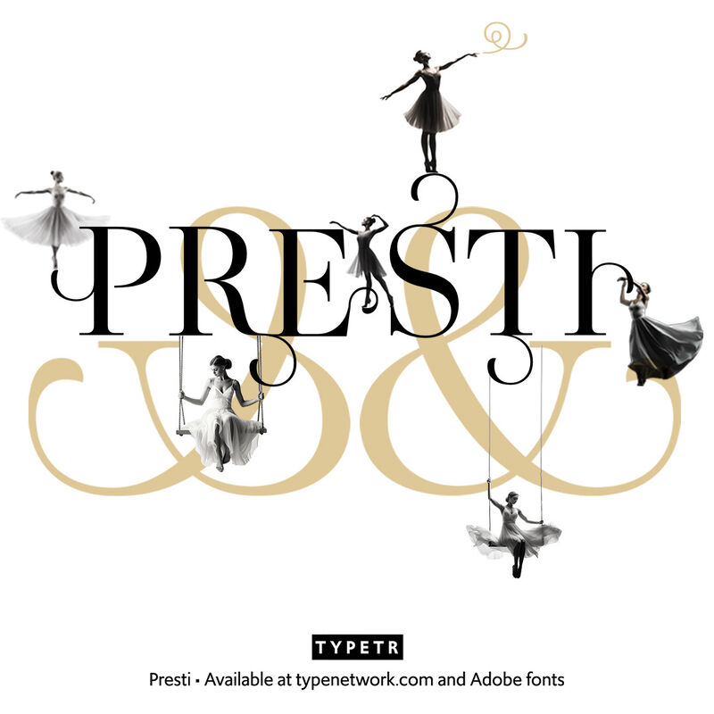
TYPETR Presti
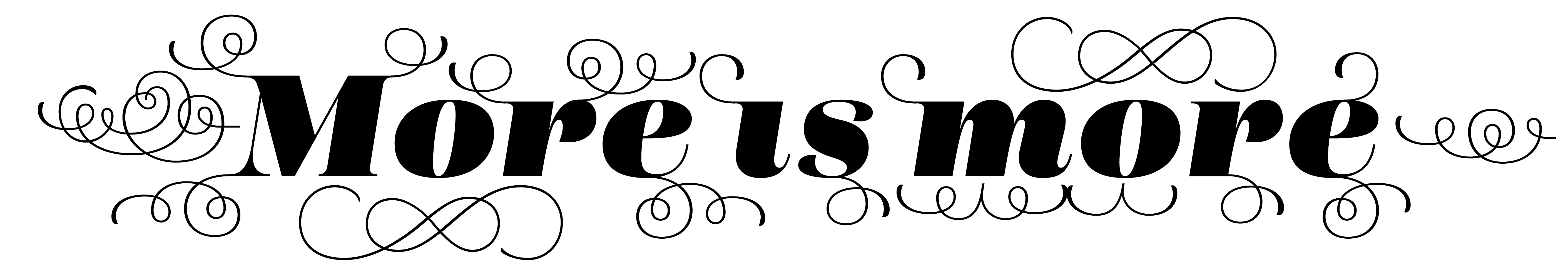
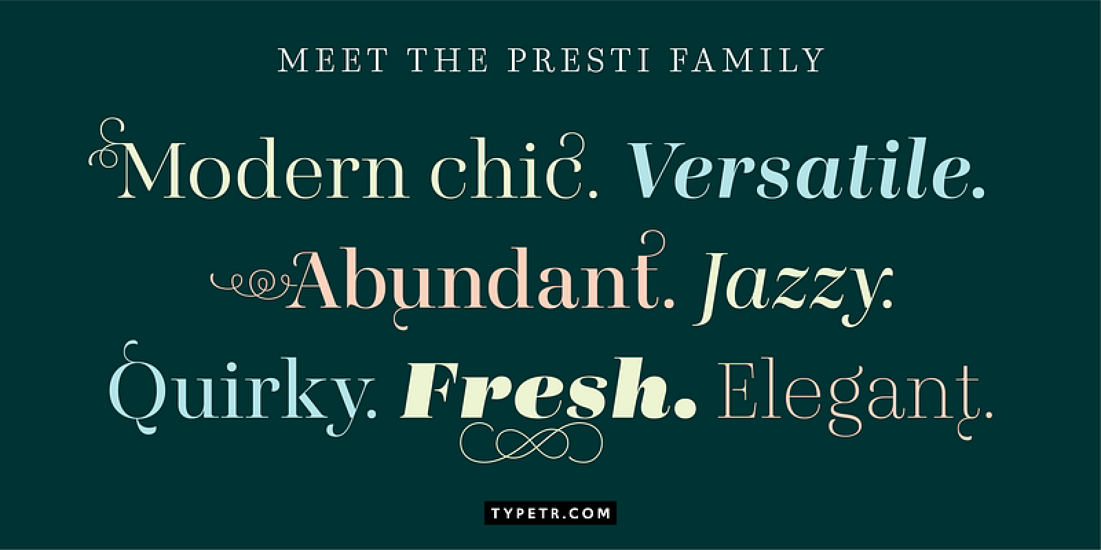
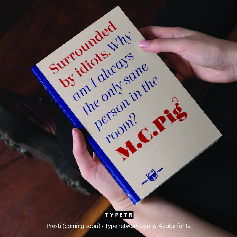
Presti is basically constructed as “expansion contrast," as written with a sharp-nib pencil. The classic appearance is emphasized by the many Open Type features (such as a choice of figures and small caps) and the extensive set of floating flourishes. These can be attached to most letters on eight different positions, two directions, and five sizes. In the Open Type stylistic set a range of predefined flourish settings can be selected, but the user can create any other combination using a simple set of codes. Presti comes in a wide range of weights, classic Roman, and romantic italic.